/

Weee!

Weee!

Weee!

UI/UX Design

Design Sprint

Weee! is the leading Asian and Hispanic e-grocer in the U.S., delivering more than 10,000 locally sourced and hard-to-find goods from around the globe directly to customers.

Weee! is the leading Asian and Hispanic e-grocer in the U.S., delivering more than 10,000 locally sourced and hard-to-find goods from around the globe directly to customers.

Background

Role:

Sole UI/UX Designer

Timeline:

2.5 Days

Tools:

Figma

The Challenge

Refine an aspect of the existing mobile app to enhance its visual appeal and consistency.

The Challenge

Refine an aspect of the existing mobile app to enhance its visual appeal and consistency.

The Challenge

Refine an aspect of the existing mobile app to enhance its visual appeal and consistency.

Without introducing complex, novel features, I was tasked to elevate the aesthetics and overall user experience of an existing experience in the app. The challenge emphasized avoiding new intricate features that could be challenging to implement.

Without introducing complex, novel features, I was tasked to elevate the aesthetics and overall user experience of an existing experience in the app. The challenge emphasized avoiding new intricate features that could be challenging to implement.

Problem Discovery

Understanding existing issues in the app

Problem Discovery

Understanding existing issues in the app

Problem Discovery

Understanding existing issues in the app

To understand what issues exist in the experience, I went through reviews of the Weee! app in the Apple Store and Google Play. I found a few reoccurring themes related to logistics or food delivery, and focused on themes I could solve within the scope of this assignment. One issue that stood out to me were pain points around searching for items in the app.

To understand what issues exist in the experience, I went through reviews of the Weee! app in the Apple Store and Google Play. I found a few reoccurring themes related to logistics or food delivery, and focused on themes I could solve within the scope of this assignment. One issue that stood out to me were pain points around searching for items in the app.

To deepen my understanding of online grocery shoppers, I conducted secondary research to learn about how issues with the search feature affects their behavior and feelings.

76%

of users report that an unsuccessful search resulted in a lost sale for the retail website

69%

of shoppers purchase additional items after a successful search

52%

abandon their entire cart and go elsewhere if there’s at least one item they can’t find

99%

are somewhat likely to return if there is a good search function

75%

are less loyal to a brand when it’s hard to find what they want on a website

77%

avoid websites where they’ve experienced search difficulties

Now that I had insights on the shoppers' end, I explored the Weee! app to learn more about the current search experience. As I searched various items on the app, I found that:

Irrelevant search results and filters appear.

There's an opportunity to recommend similar products for sold out items.

Showing sold out items is inconsistent. In the screenshots above, the frozen gimbap does not show up in the mobile search results, even though it exists within the database (accessed via desktop).

Ideation

Refining Search

Ideation

Refining Search

Ideation

Refining Search

Now that I've gone through pain points around the search experience, I was ready to start brainstorming possible changes to the current experience–focusing on issues I found around filters and out of stock items. Before sketching, I conducted research around how other e-commerce apps use filters and handle recommendations of similar items.

Now that I've gone through pain points around the search experience, I was ready to start brainstorming possible changes to the current experience–focusing on issues I found around filters and out of stock items. Before sketching, I conducted research around how other e-commerce apps use filters and handle recommendations of similar items.

Amazon utilizes price filters as shoppers type in their search terms

Petco adds relevant categories, separate from search term results

Amazon uses a bottom module for related products

For substitutions when an item is out of stock, Instacart uses a bottom module as well.

With these insights from competitors, I started sketching possible solutions.

Designing

High-Fidelity Wireframes

Designing

High-Fidelity Wireframes

Designing

High-Fidelity Wireframes

Looking through my sketches, I weighed the pros and cons for each solution and narrowed down to my final solutions:

  1. Relevant search filters appear a step earlier.
    Giving shoppers the option to filter their results prior to receiving them gives them a more refined list from the start. This prevents any negative feelings around "unrelated" results they might see.

  2. For sold out items, adding a button for similar products could make up for any negative feelings shoppers may have.
    Shoppers have the opportunity to find a new product that is similar to what they are already looking for. Moreover, the business will not lose out on a sale if the shopper decides to purchase the similar product.

Looking through my sketches, I weighed the pros and cons for each solution and narrowed down to my final solutions:

  1. Making search filters appear one step up.
    Giving shoppers the option to filter their results prior to receiving them allows them for a more refined list.

  2. For sold out items, adding a button for similar products could make up for any negative feelings shoppers m

Design

Visual Changes

Design

Visual Changes

Design

Visual Changes

There are a few changes I made in color and type treatment to create a more consistent visual aesthetic within the app.

There are a few changes I made in color and type treatment to create a more consistent visual aesthetic within the app.

Item Elements

Before

Before

Before

After

After

After

  1. Top tags utilize the same colors as the category icons (Meat & Seafood, Fruits, etc). Also, the "Limited" tag features the item quantity–freeing up the space under the item price (where it states "Only 20 left – order soon").

  2. Item weight or quantity separated from item name for better visibility

  3. Lower font weight and size of the original price to let the sale price shine more

  4. Pricing for non-sale items changed to black in order to keep the red text meaningful

Navigation Bar

The current navigation bar features spacing issues as a result of long names for featured pages (i.e. Inspiration and Restaurant). I played with the solution of a center circle to highlight the Home page, while filling in some of the odd spaces.

The current navigation bar features spacing issues as a result of long names for featured pages (i.e. Inspiration and Restaurant). I played wit

Search Bar

Learning that the search bar is an essential part of shoppers' experience, I changed its color to give it more contrast–thus more visual importance than most other elements.

The current navigation bar features spacing issues as a result of long names for featured pages (i.e. Inspiration and Restaurant). I played wit

Before

Before

Before

After

After

After

Next Steps

If I had more time, I would...

Next Steps

If I had more time, I would...

Next Steps

If I had more time, I would...

  1. Conduct more research around shoppers' behavior, specific to the Weee! app search experience

It would be useful to understand Weee! shoppers' specific pain points and learn more about their thought process when they utilize the search bar.

  1. Validate my solutions through user testing

I would like to test my solutions to understand whether Weee! shoppers find them helpful and whether it enhances their shopping experience.

Projects

Other works

Projects

Other works

Projects

Other works

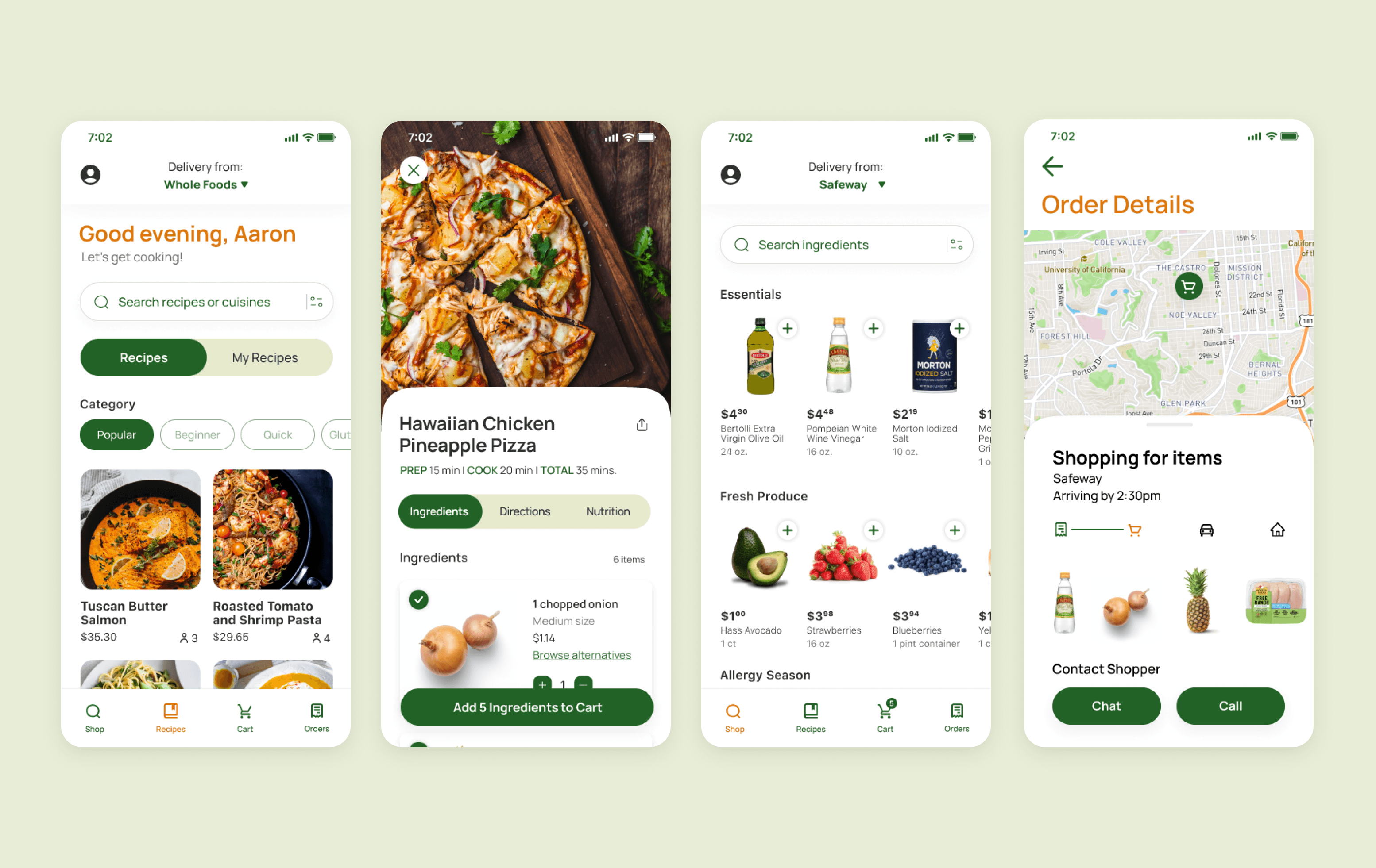
Making eating at home less of a chore

iOS App Design

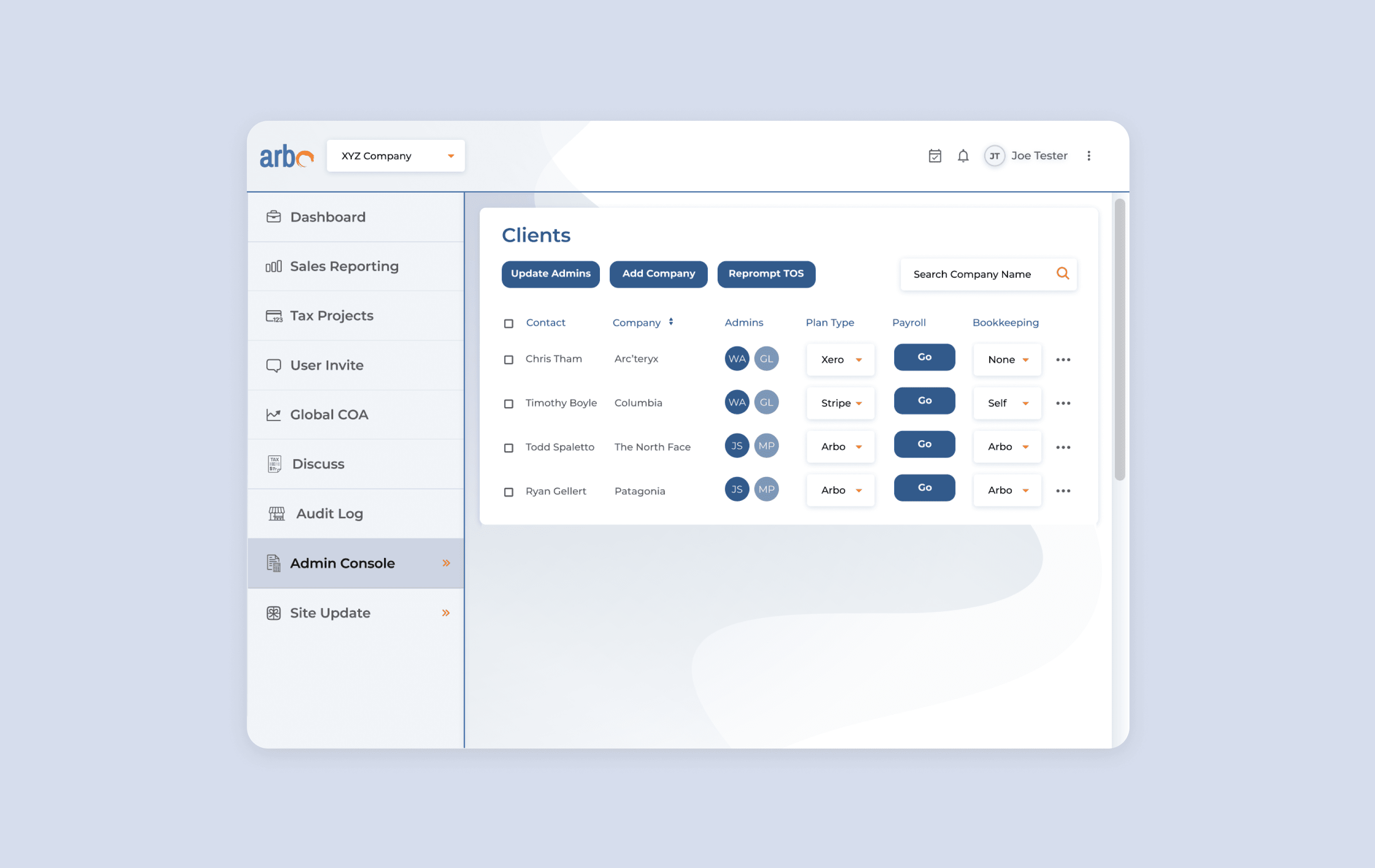
Optimizing productivity & communication

Web Redesign

Contact

Let's get creative!

I'm ready to dive in to new projects or opportunities.

You can contact me at:

kristinenodalo@gmail.com

San Francisco, CA

Contact

Let's get creative!

I'm ready to dive in to new projects or opportunities.

You can contact me at:

kristinenodalo@gmail.com

San Francisco, CA

Contact

Let's get creative!

I'm ready to dive in to new projects or opportunities.

You can contact me at:

kristinenodalo@gmail.com

San Francisco, CA

© 2023 Kristine Nodalo

© 2023 Kristine Nodalo

© 2023 Kristine Nodalo