Background
Role:
Sole UI/UX Designer
Timeline:
7 Months
Tools:
Figma, Miro
82%
find healthy eating important to them
72%
of those who value healthy eating are not satisfied with how they eat
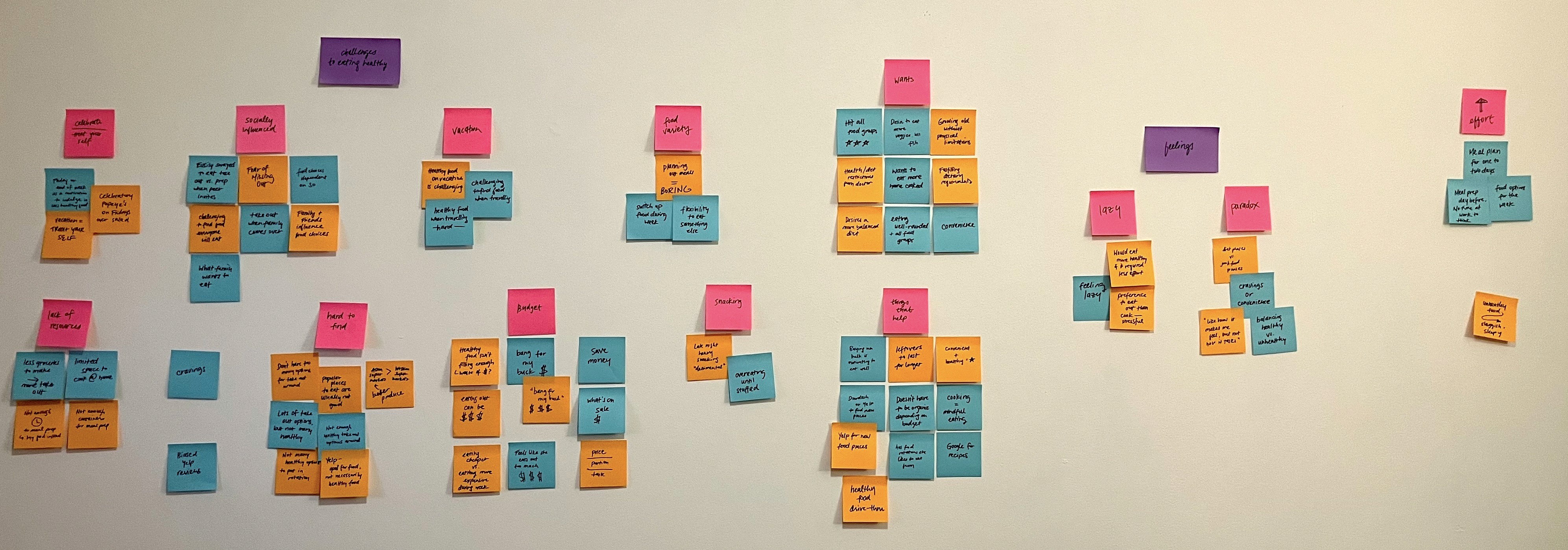
In my readings, I found the main barriers to eating healthier:
Affordability
“The cost of fresh food was identified as a barrier to eating healthy, especially among low-income members of the community.”
Availability
“Because the availability of affordable food is limited, some make poor food choices, not because they eat without thinking about the unhealthy consequences”
Awareness of what’s healthy
“a quarter of people say that they don’t know what healthy and sustainable food is”
Lack of time
“The time required to shop and prepare food was identified as a major barrier for people who already struggled with busy family and work schedules.”
On the flip side, I also looked into what helps people eat healthier and found that:
Home-cooked meals encourage healthier eating.
Encourages higher fruit and vegetable intake
Likelihood for normal range BMI
Lower risk in high cholesterol and diabetes
Lower body fat
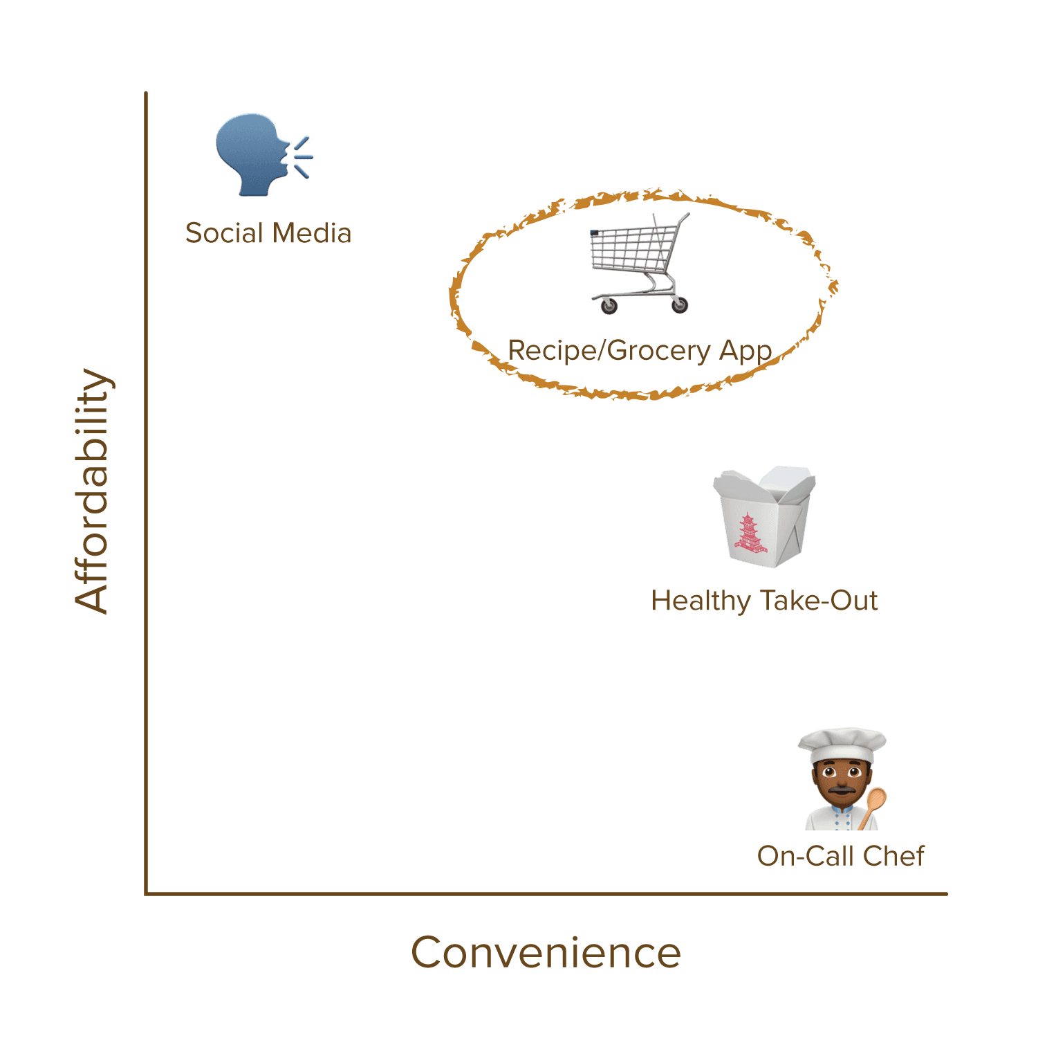
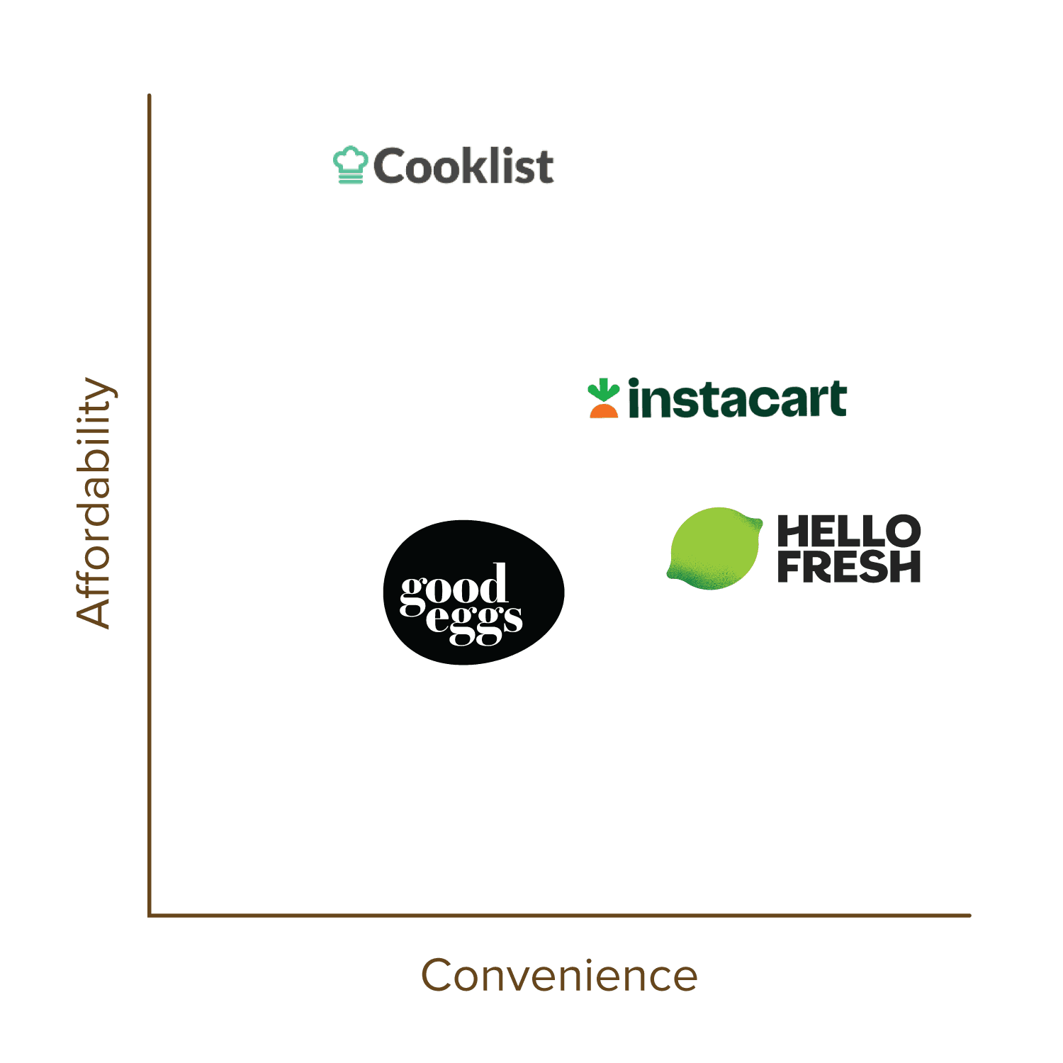
Convenience is key.
The solution needs to it reduce the amount of steps or mental gymnastics to get meal time done.
Affordability is a main concern.
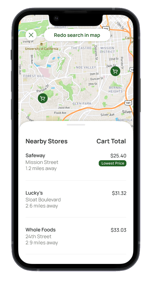
Users shop with a budget in mind and prefer to find deals in order to save money.
Less healthy options are everywhere.
It's harder to choose healthier options when there's easy access to tasty, less-good-for-you take out.
Desire for homecooked.
Users want to cook at home as it allows them to save money and to control what ingredients go in their food.
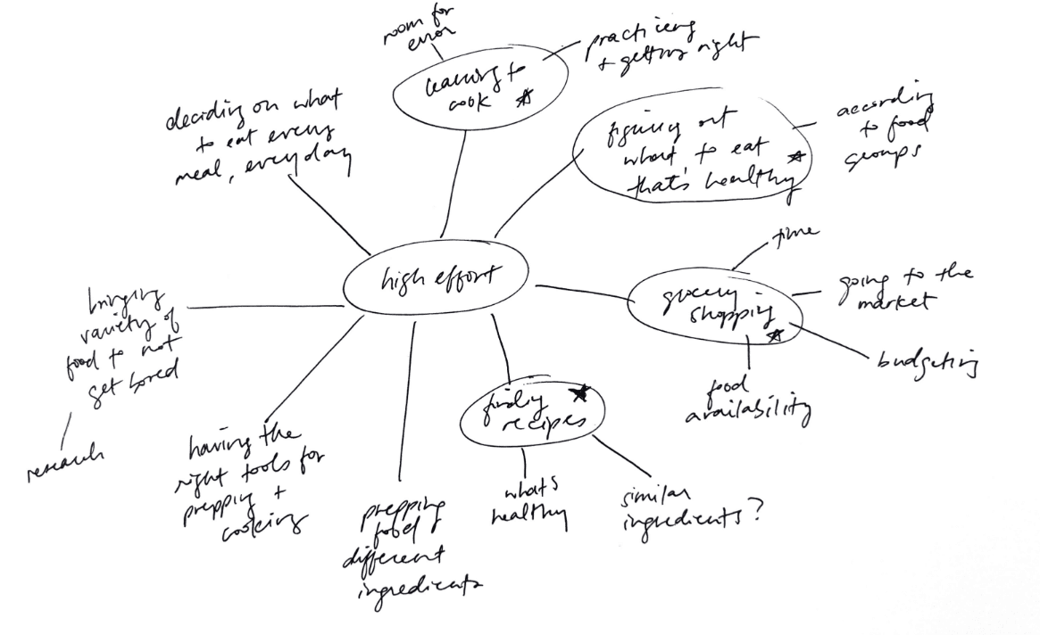
Meal time is overwhelming.
For busy individuals, thinking about what to eat and where to get it–every single day–can be mentally exhausting.
Lack of prep leads to take out.
People tend to opt for getting take out if they don’t have enough groceries to make anything at home.
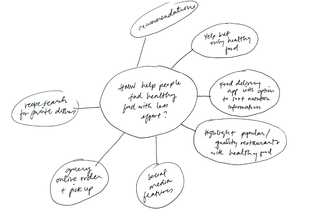
Based on interviews and empathy maps, I created a persona that captured the challenges, motivations, and goals of the target users to better inform the design.
"I'm trying to eat more homemade meals, but it often comes down to convenience when I'm too busy or lazy."
Motivations
Keep body and mind in good shape
Feeling healthy = wellness and productivity
Frustrations
Lack of time and energy to ensure groceries are at home
Lack of ingredients to cook a meal
Increasing prioritization of pricing information
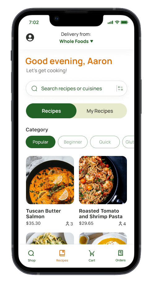
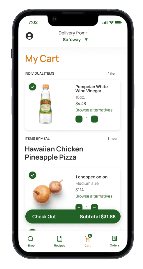
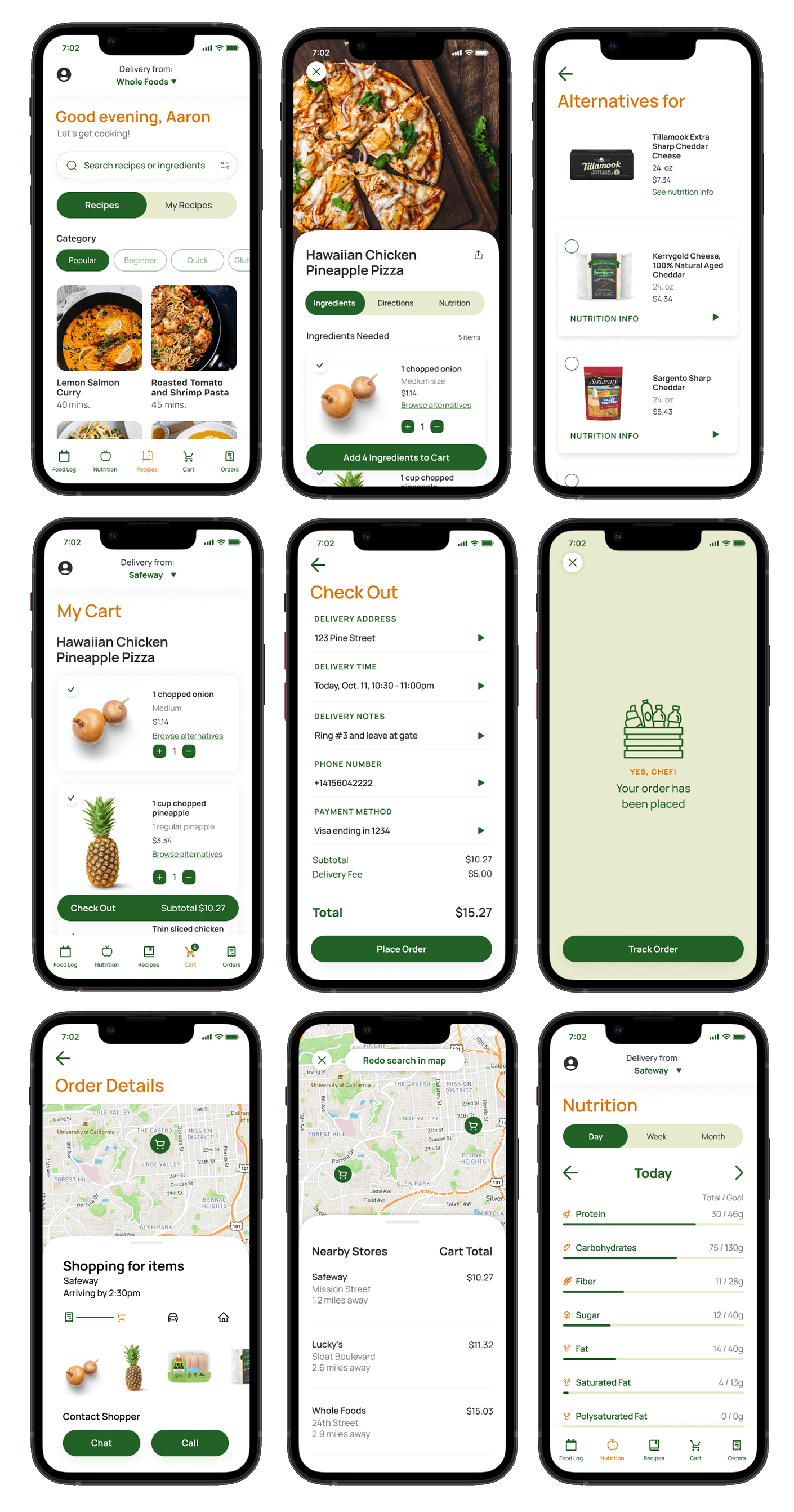
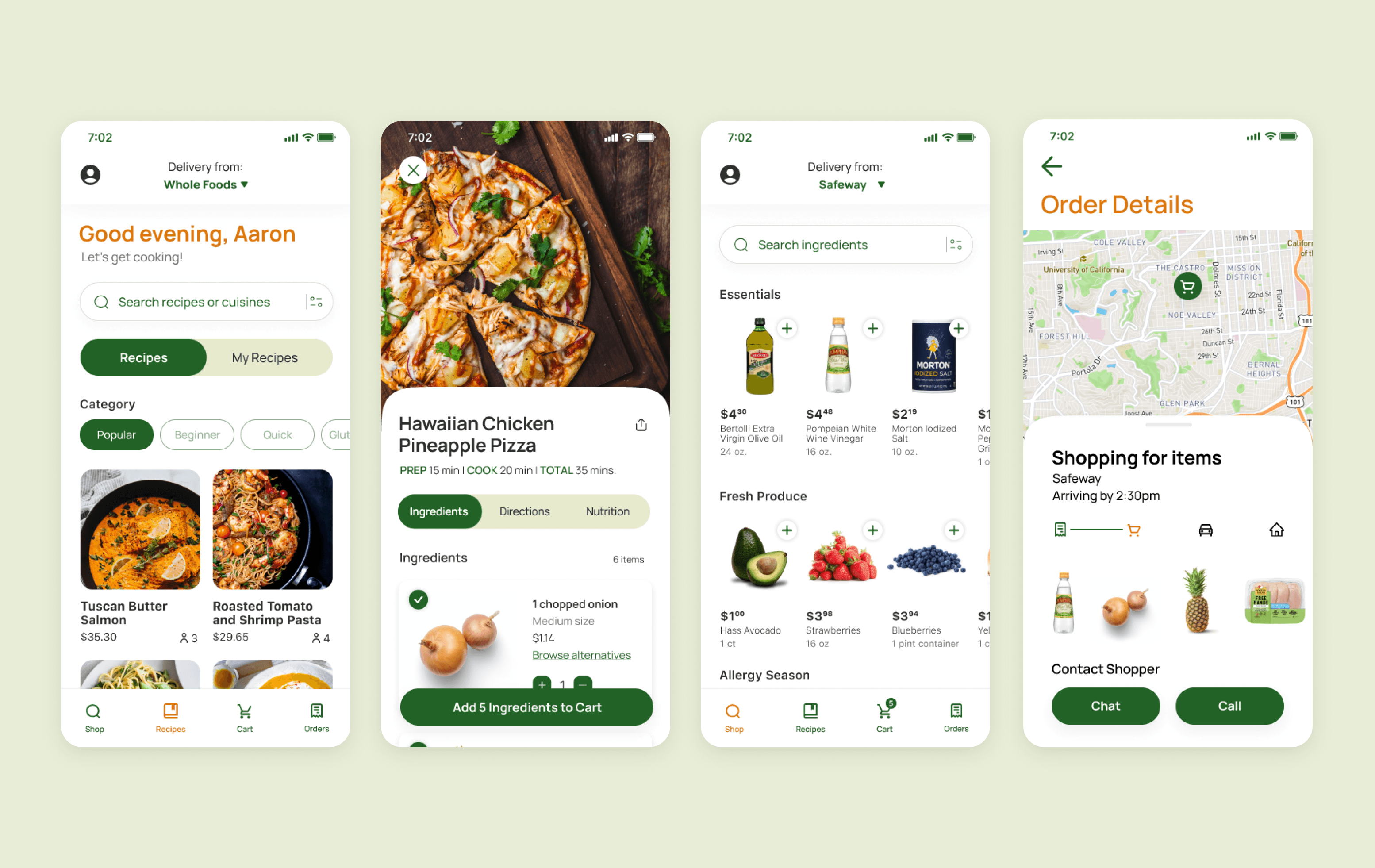
Users expressed a need for pricing at the start. Because I had already designed the app to have filters for quick recipes, I replaced cooking time information with pricing and price per serving information instead, and treated it with greater visual hierarchy.
Shopping for Individual ingredients
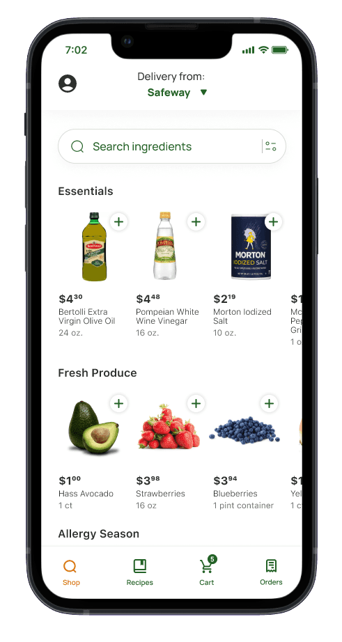
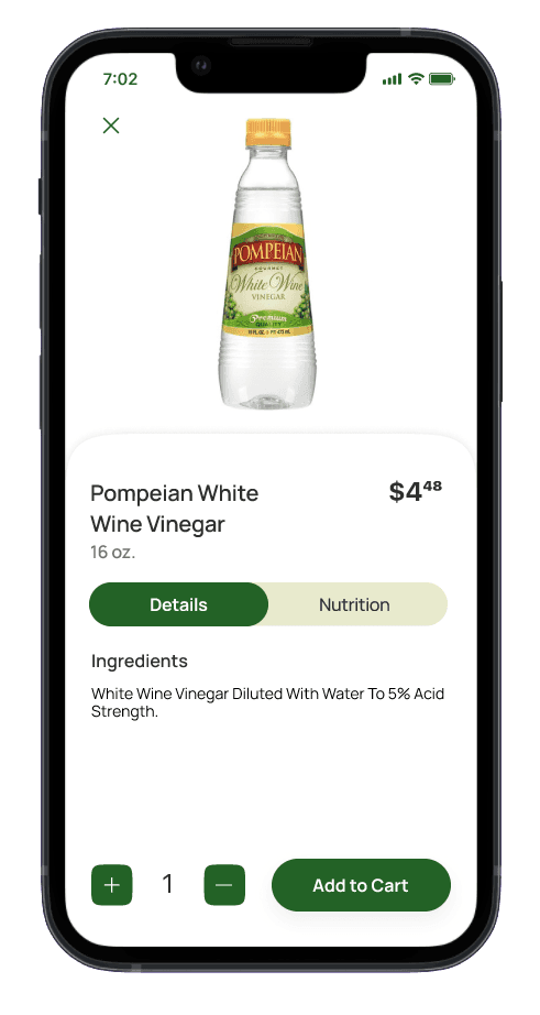
The second major improvement was adding a feature for buying individual ingredients, instead of recipe-based. Users may need a one-off ingredient–like a new tub of butter or a few missing ingredients for a recipe. This added feature increases the app’s usability in our users’ everyday needs.
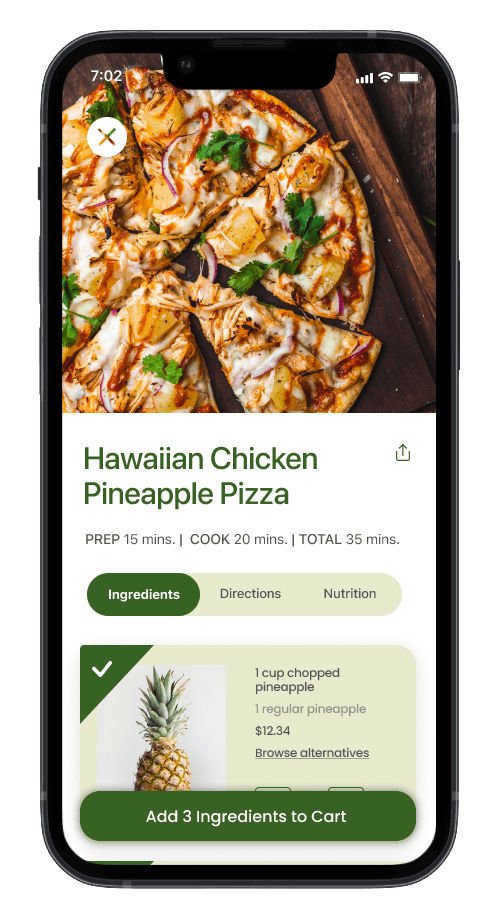
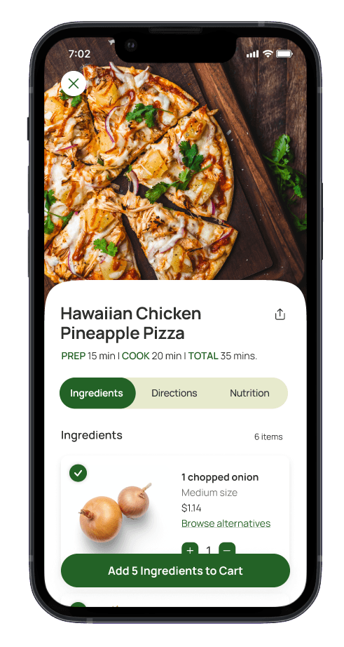
Simplify the interface
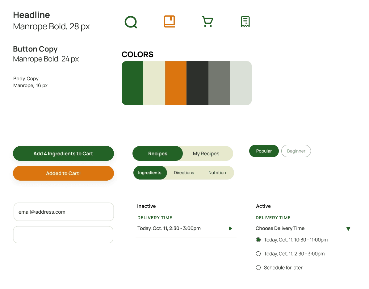
Users found initial versions overwhelming because the app’s nature is to have a lot varying imagery and information. It became important for the UI to feel clear and simple. Changes include: redesigned the user interface to use color only where it was necessary and decreased harsh shadows.
→
Start simple and add when necessary.
Starting with the bare minimum and adding colors or elements only when there is a necessity or intention is the best way to go to prevent overdoing it. It's more efficient to work with intention so you don't end up back tracking.
Every decision should be intentional.
Not just for the elements on the screen or the information we show within the app, but also for the research, like the questions I ask during a user interview or a usability test. It’s important to know why a question is being asked to make sure it helps the process.
Evolving to a premium listening experience
iOS App Design
Optimizing productivity and communication
Website Redesign

