Arbo
Arbo
Arbo Technologies provides financing support for budding startups, including insights, bookkeeping, tax, and CFO services. I collaborated with two other designers to help Arbo with a redesign of their accountant dashboard.
Arbo Technologies provides financing support for budding startups, including insights, bookkeeping, tax, and CFO services. I collaborated with two other designers to help Arbo with a redesign of their accountant dashboard.
Role:
UI/UX Designer
Team Members:
Devin Johnson, UI/UX
Darvlyn McLean, UI/UX
Timeline:
1 Month
Tools:
Figma
The Challenge
Redesign the dashboard for improved team productivity and project visibility.
The Challenge
Redesign the dashboard for improved team productivity and project visibility.
The Challenge
Redesign the dashboard for improved team productivity and project visibility.
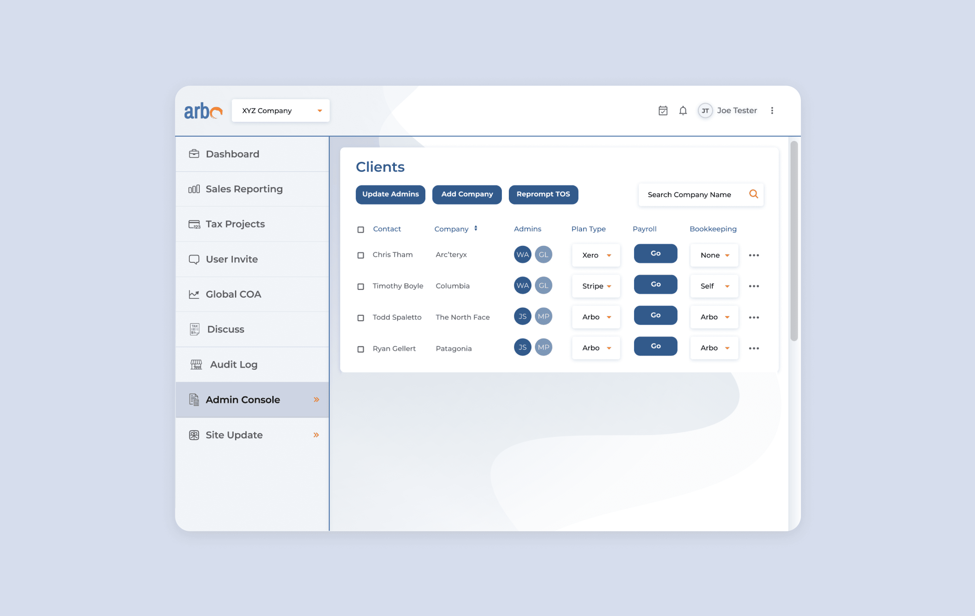
The accountant dashboard is where Arbo's accountants manage their clients’ finance projects. It is their main tool for communicating with clients, filling out and organizing important documents, and collaborating with colleagues regarding tax projects. While this system would be used internally, they hope to one day offer it to other accounting teams and professionals.
The accountant dashboard is where Arbo's accountants manage their clients’ finance projects. It is their main tool for communicating with clients, filling out and organizing important documents, and collaborating with colleagues regarding tax projects. While this system would be used internally, they hope to one day offer it to other accounting teams and professionals.
Research
Taking notes from competitors and experts
Research
Taking notes from competitors and experts
Research
Taking notes from competitors and experts
To better understand the industry, our 3-person team conducted a competitive analysis of Arbo’s direct competitors. Because we were redesigning Arbo’s internal accountant portal, it was difficult to do a 1:1 comparison as most competitors only allowed signing up as a client.
Given our limited content for analysis and time constraints, we did a quick and thorough analysis of Arbo’s competitor companies through the lens of visual style:






Bench showcased information well by using ample visual hierarchy. Their decisions for text hierarchy, negative space, and accented colors create a dashboard that is easy to scan and read through.
Wave displays their metrics with graphs, lists, and tables. This adds visual interest and it creates a distinction between different types of data sets. Furthermore, they decrease sensory overload by hiding actions behind drop-down menus.
Quickbooks utilizes simple iconography and hover functions to explain processes or display more information. This keeps their user interface minimal and easy to scan.
Research
Evaluating the Current Design
Research
Evaluating the Current Design
Research
Evaluating the Current Design
Next, I conducted a heuristic evaluation of Arbo’s system. It was clear to see that their competitors’ interfaces were easier to read, more minimal, and friendlier to the user. Based on my research, I was motivated to bring more functional elements, visual hierarchy, and a cleaner look to Arbo’s dashboard.
During this project, our team divided the work and I focused on two parts of Arbo’s internal dashboard–the Admins and Clients pages.
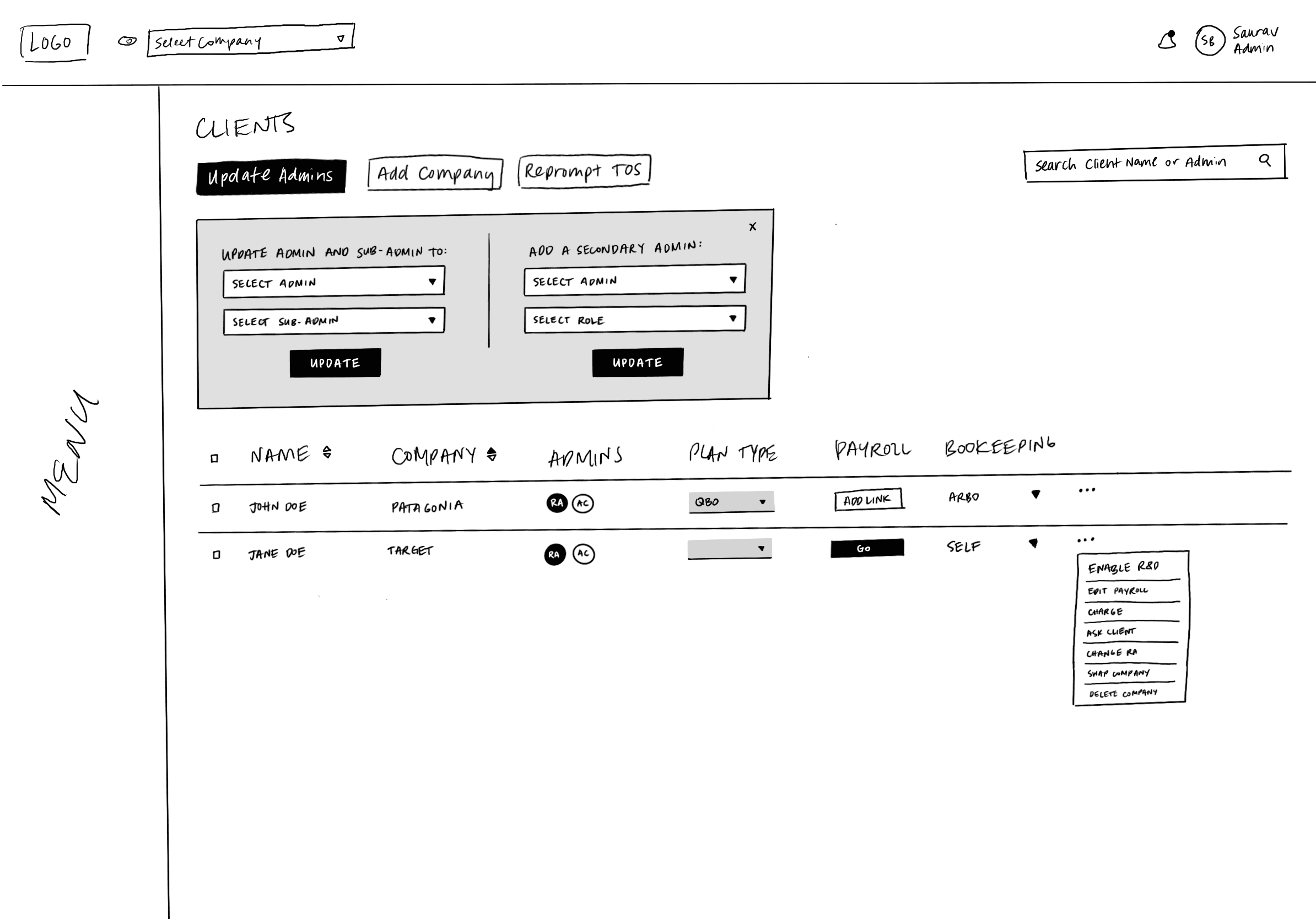
The Clients page detailed information regarding each client: who managed their projects, what kind of bookkeeping plan they use, payroll information. This page also had a list of actions that accountants could interact with, in relation to each client.
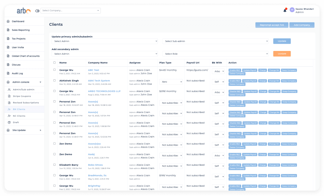

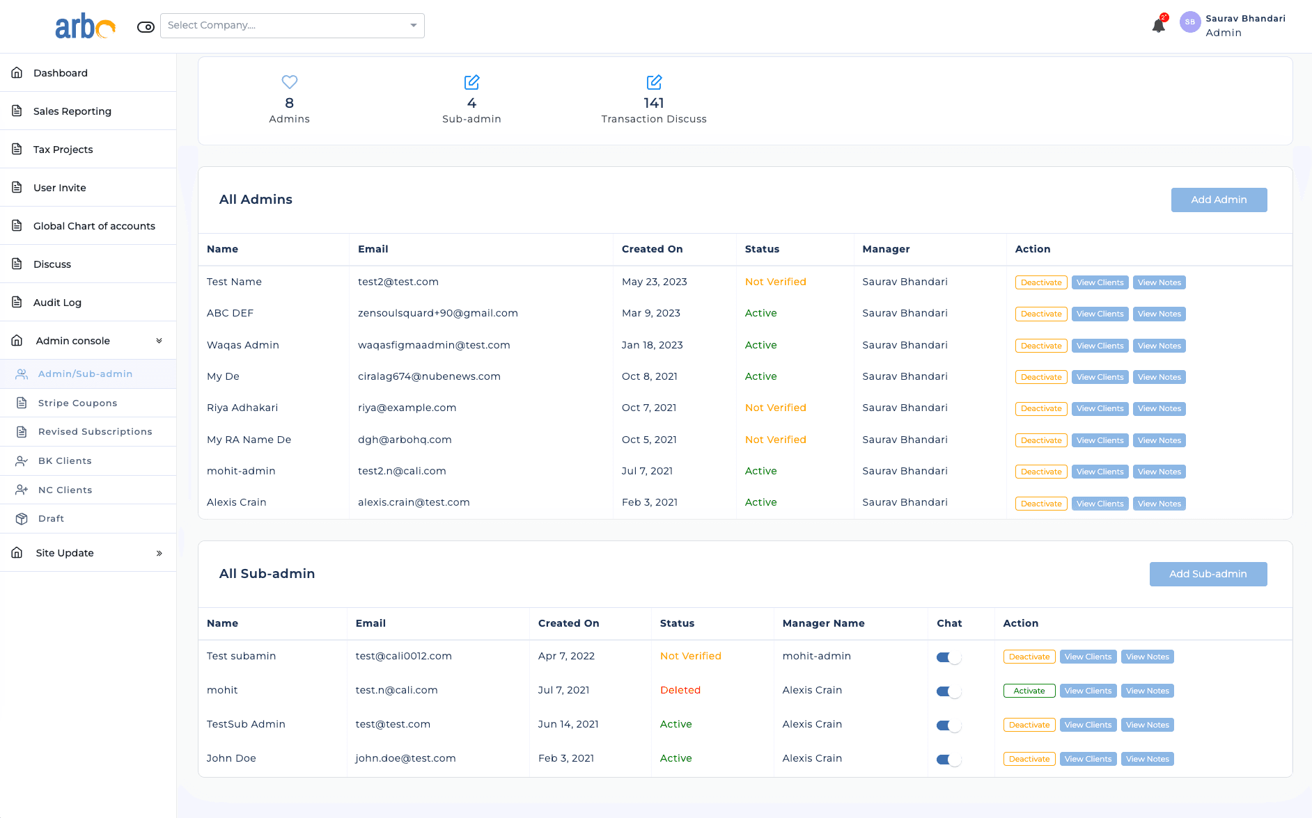
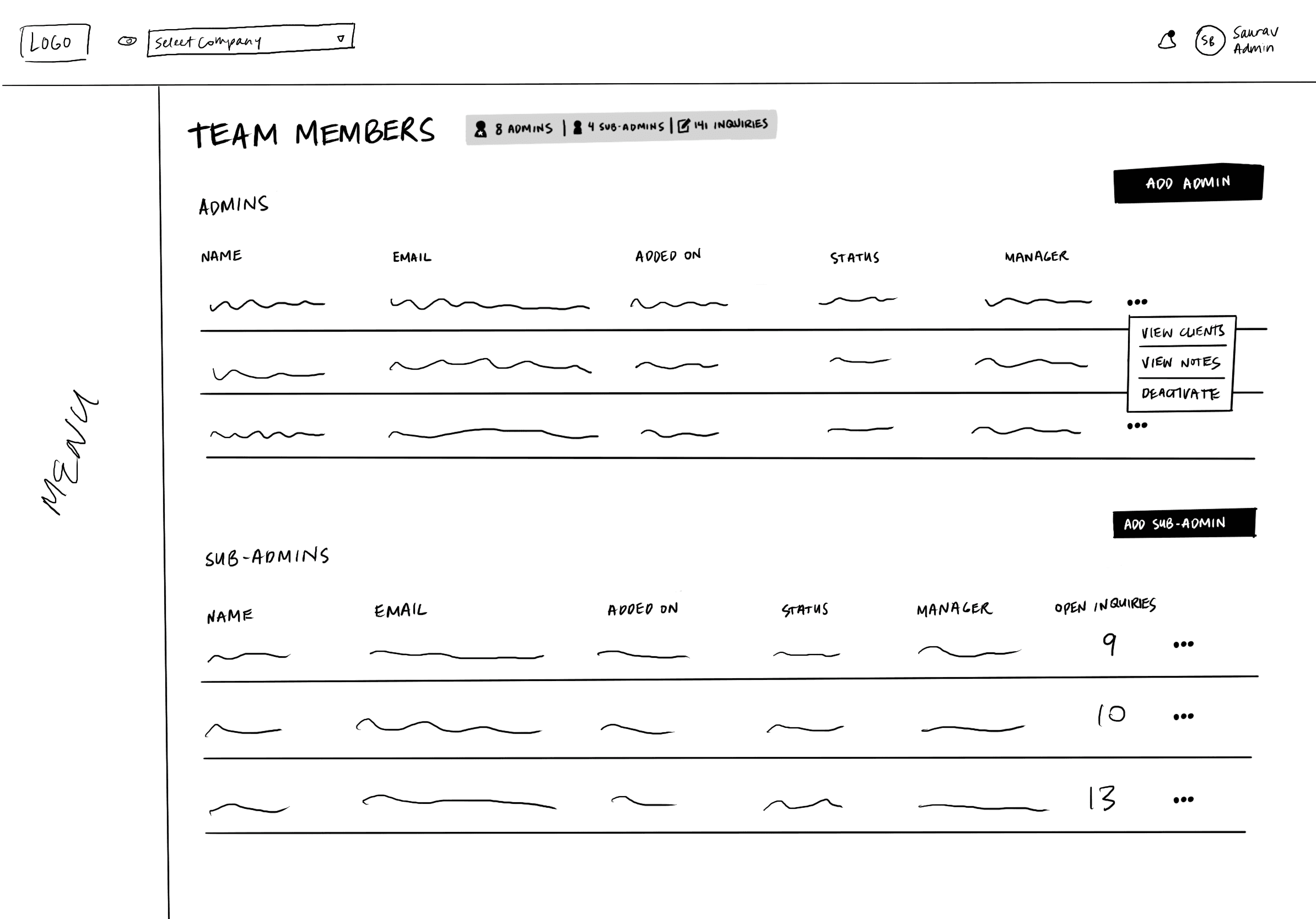
The Team Members page was a simple list of managers and colleagues on the Arbo team. It showed information regarding contact information, client list, notes, and workplace hierarchy.
The Team Members page was a simple list of managers and colleagues on the Arbo team. It showed information regarding contact information, client list, notes, and workplace hierarchy.

Ideation
User Journey
Ideation
User Journey
Ideation
User Journey
I did a deep dive on elements and user flows each page was connected to–keeping in mind our goal of improving the user experience in a way that increases productivity. Thinking about the user and my research, I sketched out ideas and improvements to user flows for certain tasks within these pages, and presented them to our team.
I did a deep dive on elements and user flows each page was connected to–keeping in mind our goal of improving the user experience in a way that increases productivity. Thinking about the user and my research, I sketched out ideas and improvements to user flows for certain tasks within these pages, and presented them to our team.
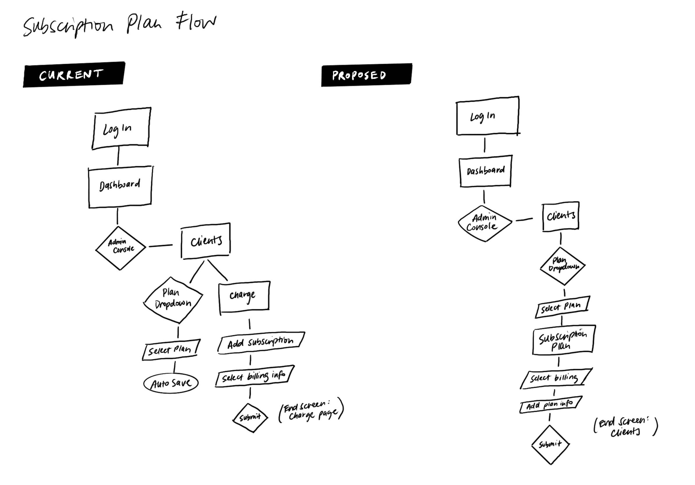

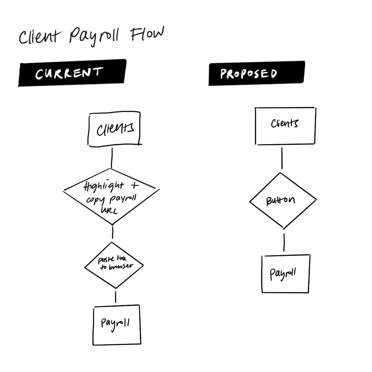

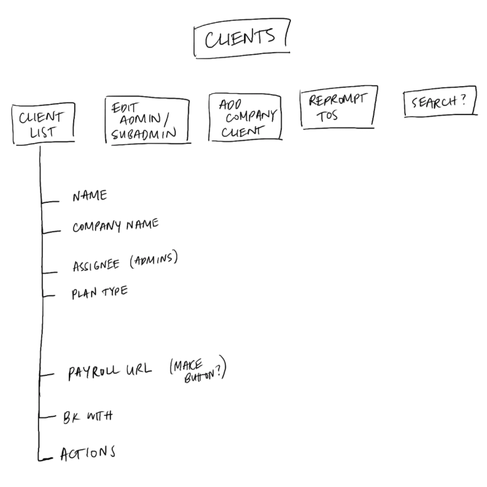

During this deep dive, I found a few areas of improvement:
Some tasks could be achieved in less steps. I encountered tasks that required users to either backtrack or perform unnecessary actions. For example, when an accountant needs to update subscription plans for multiple clients, they would need to find their way back to the Clients page after updating one client. Additionally, when a user needs to go to a client’s payroll system, they have to copy and paste the link from the Arbo system to their browser. This could be easily fixed with a button.
Less utilized tools don’t have to be front and center. The Clients page has a dropdown feature that allows users to change the admins in charge of specific clients. The Arbo team confirmed that changing admins for a client happens infrequently (around once every several months). Thus, this feature can be tucked in somewhere else on the screen, instead of first and foremost.
Clutter makes things overwhelming. Both screens displayed a lot of information or links in a table format, which makes it more difficult to view. A re-evaluation of what is necessary content could make these pages easier to read and create room for more significant details.
Ideation
Wireframing
Ideation
Wireframing
Ideation
Wireframing
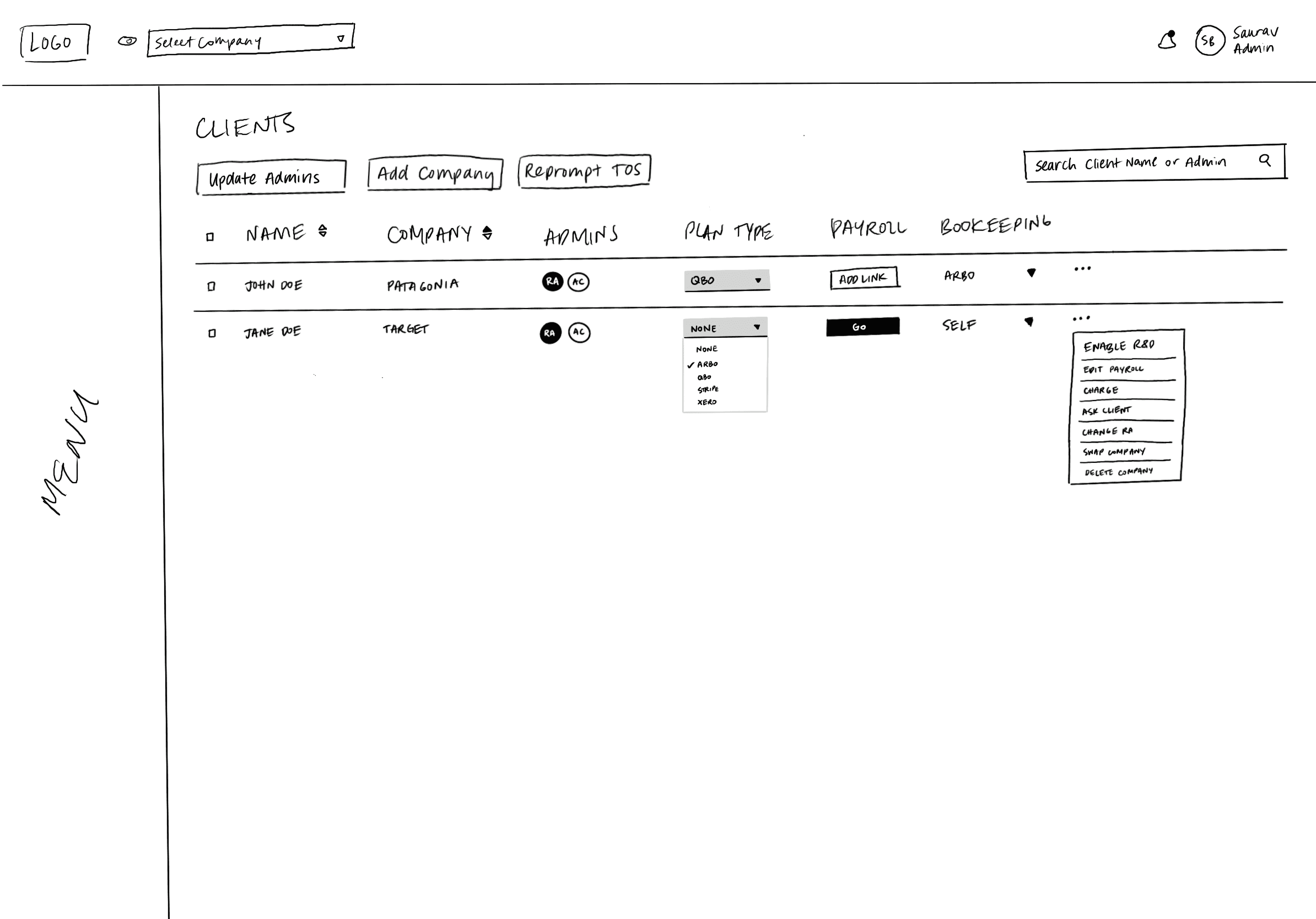
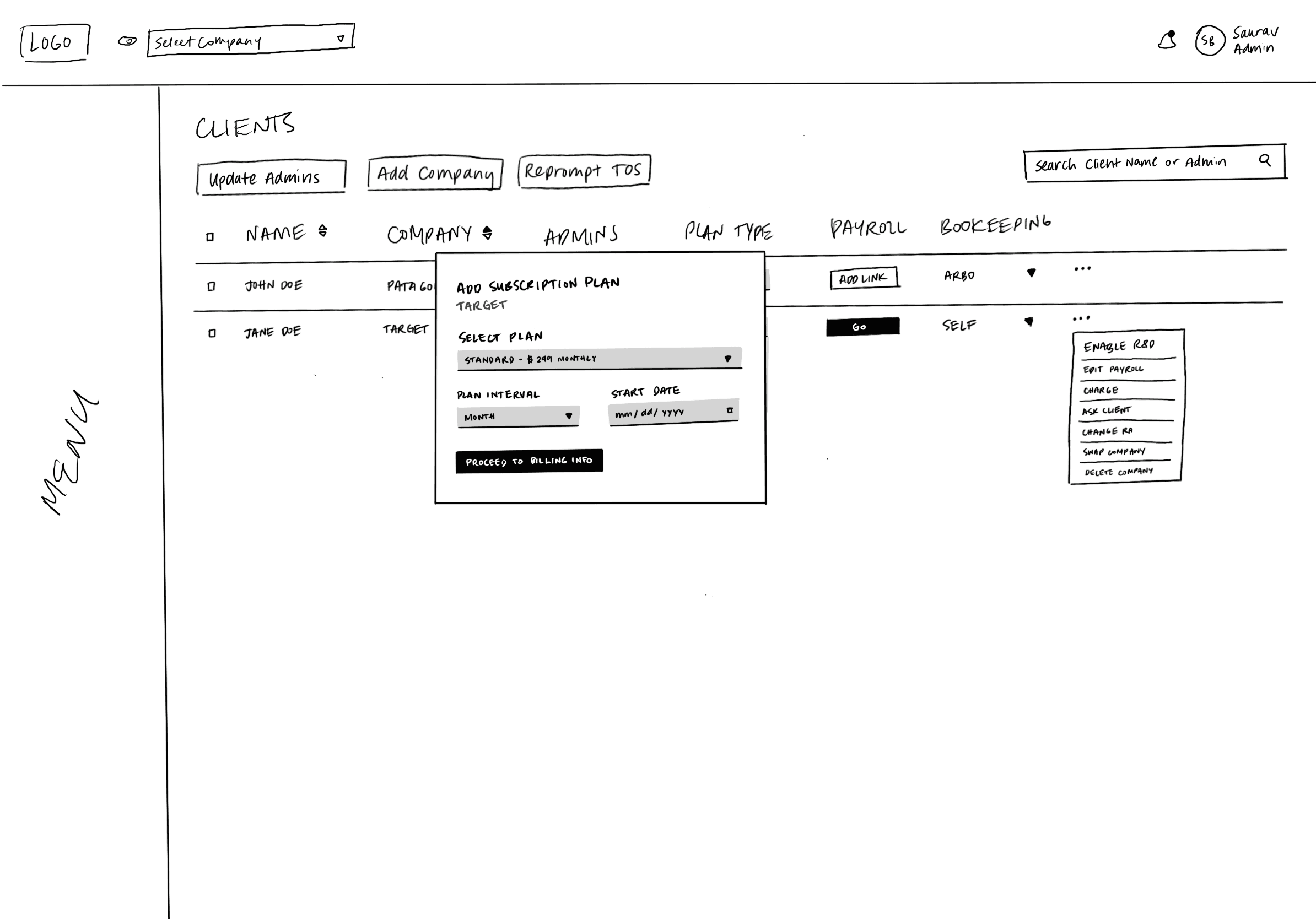
With my findings, I sketched possible solutions, focusing on highlighting important elements, decluttering, and completing tasks in less steps. I presented my conclusions to our team–who gave me the confidence and approval to move onto making high-fidelity wireframes (to use for usability testing).
With my findings, I sketched possible solutions, focusing on highlighting important elements, decluttering, and completing tasks in less steps. I presented my conclusions to our team–who gave me the confidence and approval to move onto making high-fidelity wireframes (to use for usability testing).







Validate
Usability Testing
Validate
Usability Testing
Validate
Usability Testing
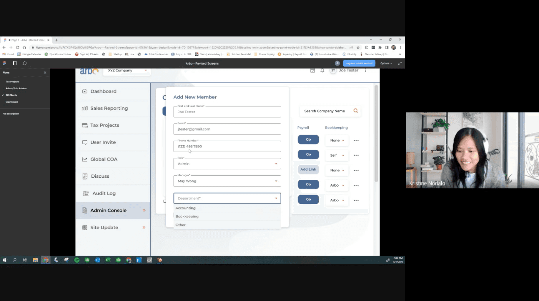
To validate the effectiveness of my solutions, I conducted usability testing interviews with three accountants from the same firm. Probing for insights regarding the ease or difficulty of completing main tasks on each page, participants gave extremely positive feedback, with suggestions for extended features.
To validate the effectiveness of my solutions, I conducted usability testing interviews with three accountants from the same firm. Probing for insights regarding the ease or difficulty of completing main tasks on each page, participants gave extremely positive feedback, with suggestions for extended features.


Final Design
To streamline the user experience, I made several improvements.
Final Design
To streamline the user experience, I made several improvements.
Final Design
To streamline the user experience, I made several improvements.
On the Clients Screen:
Reduced visual overload. Instead of having several buttons per each client row, I placed these options under a menu icon to clean up the screen.
Simplified Admin list. Admins now appear as circular icons with their initials. When hovering, a user can see the full name of the admin if more clarification is needed.
Created a pop-out module for updating admins. Since updating admins isn’t an everyday part of the workflow, I enclosed this feature behind a button to simplify the screen overall.
Added a search bar to make it easier to find a client
Created pop-up flows for adding a new client or subscription plan. Previously, these flows took you to a completely different screen and a user would need to navigate back to the Client screen, requiring extra clicks. We’ve designed these flows to now utilize a pop-up form so that the user stays on the client screen, allowing for a more efficient process when a user needs to add multiple clients or plans.
Changed the payroll link to a button for ease of use. Instead of copying and pasting the URL, users can easily click a button to get to the client’s payroll site.
On the Team Members Screen:
Reduced the amount of space around quick admin data points to open up space and simplify the screen.
Reduced visual overload. Instead of having several buttons per admin, I placed these options under a menu icon to clean up the screen.
Merged admin and sub-admin lists to simplify and cut down the space the lists took up. The new list allows for sorting between different roles.
Added an inquiries column to show which team member has unanswered questions. This makes it easier for managers to see which team members need more support.
Reflection
Project Takeaways
Reflection
Project Takeaways
Reflection
Project Takeaways
If something looks simple, it doesn’t mean it actually is.
Redesigning Arbo’s screens seemed a simple task at first, as they showed lists of clients or admins. However, once I dived in deeper, I found out the task flows in each page were more complex and added friction. Analyzing my screens thoroughly allowed me to find their key problems. My findings were further validated by the Arbo team, as they expressed excitement for the direction we were heading.
Take lead where you see it lacking.
With a quick timeline, a small team of three, and all the work for this redesign, it was important to me to take lead on tasks or ideas our team might have overlooked. For example, I took initiative in scheduling meetings, taking notes, and creating agendas. While these tasks may not feel like a lot of work, it helped our team stay organized and synced throughout the process.
From my research on premium subscriptions, I learned that when designing something with limitations, it’s important to enact the limit in a way that avoids a negative experience.
For example, going back to ads–an ad is usually used as a limitation tactic on a free account. It’s an intrusive tactic that forces itself onto the user during their experience with the app–which creates a negative feeling whenever it comes up.
For Curio, I wanted to challenge myself to find ways to add limitation, but without creating a negative effect. I was striving for a neutral reaction (at least), which inspired me to think of the inactive features on the audiobook player. The listener can choose to interact with it, instead of being a forced to. Moreover, this experience shows the user how valuable the feature is if they choose to interact with it–making a case for switching to a premium membership.
Projects
Other works
Projects
Other works
Projects
Other works
Making eating at home less of a chore
iOS App Design
Evolving to a premium listening experience
iOS App Design
Contact
Let's get creative!
I'm ready to dive in to new projects or opportunities.
You can contact me at:
kristinenodalo@gmail.com
San Francisco, CA
Contact
Let's get creative!
I'm ready to dive in to new projects or opportunities.
You can contact me at:
kristinenodalo@gmail.com
San Francisco, CA
Contact
Let's get creative!
I'm ready to dive in to new projects or opportunities.
You can contact me at:
kristinenodalo@gmail.com
San Francisco, CA
© 2024 Kristine Nodalo
© 2024 Kristine Nodalo
© 2024 Kristine Nodalo

