Background
Role:
Sole UI/UX Designer
Timeline:
4 Weeks
Tools:
Figma, Miro
My key takeaways and their design implications:
Enjoyment is key to conversion.
Keep the user experience delightful so they keep coming back.
No ads 🚫
Audiobook listeners find ads disruptive and develop a negative effect on the price value of premium subscriptions.
Get personal 🤝
Make it easy for listeners to get to know your service–especially its best features. Similarly, get to know the listener's preferences and needs.
Two-way communication
Show premium benefits effectively and find ways to ask for listener preferences and feedback.
Just the bare minimum can maximize the experience.
For busy individuals, thinking about what to eat and where to get it–every single day–can be mentally exhausting.
Keep user flows and decisions short ⚡️
The easier listener's can get to what they need, the more enjoyable it becomes.
Visually showcase premium features more clearly
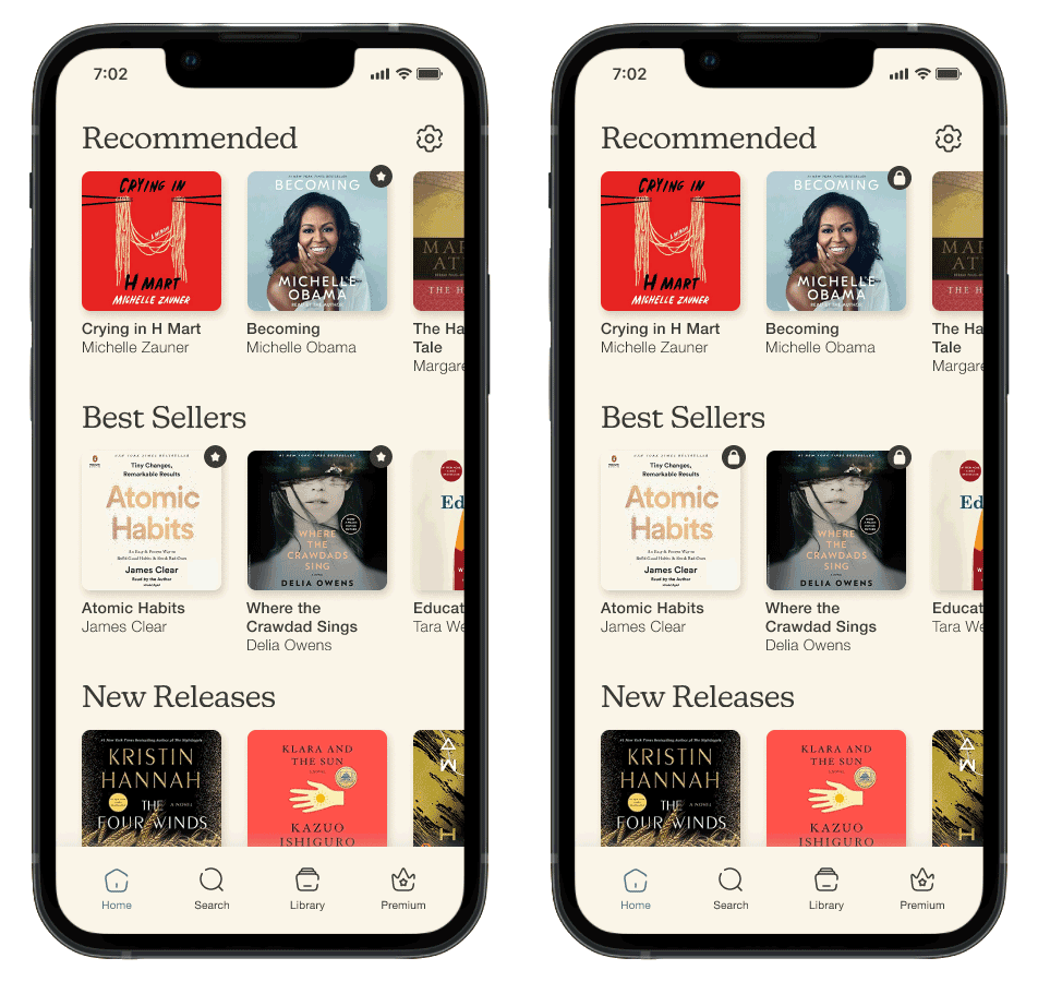
I made subtle visual changes in icons and icon color to prevent confusion towards premium features.
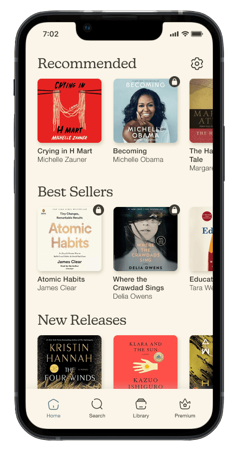
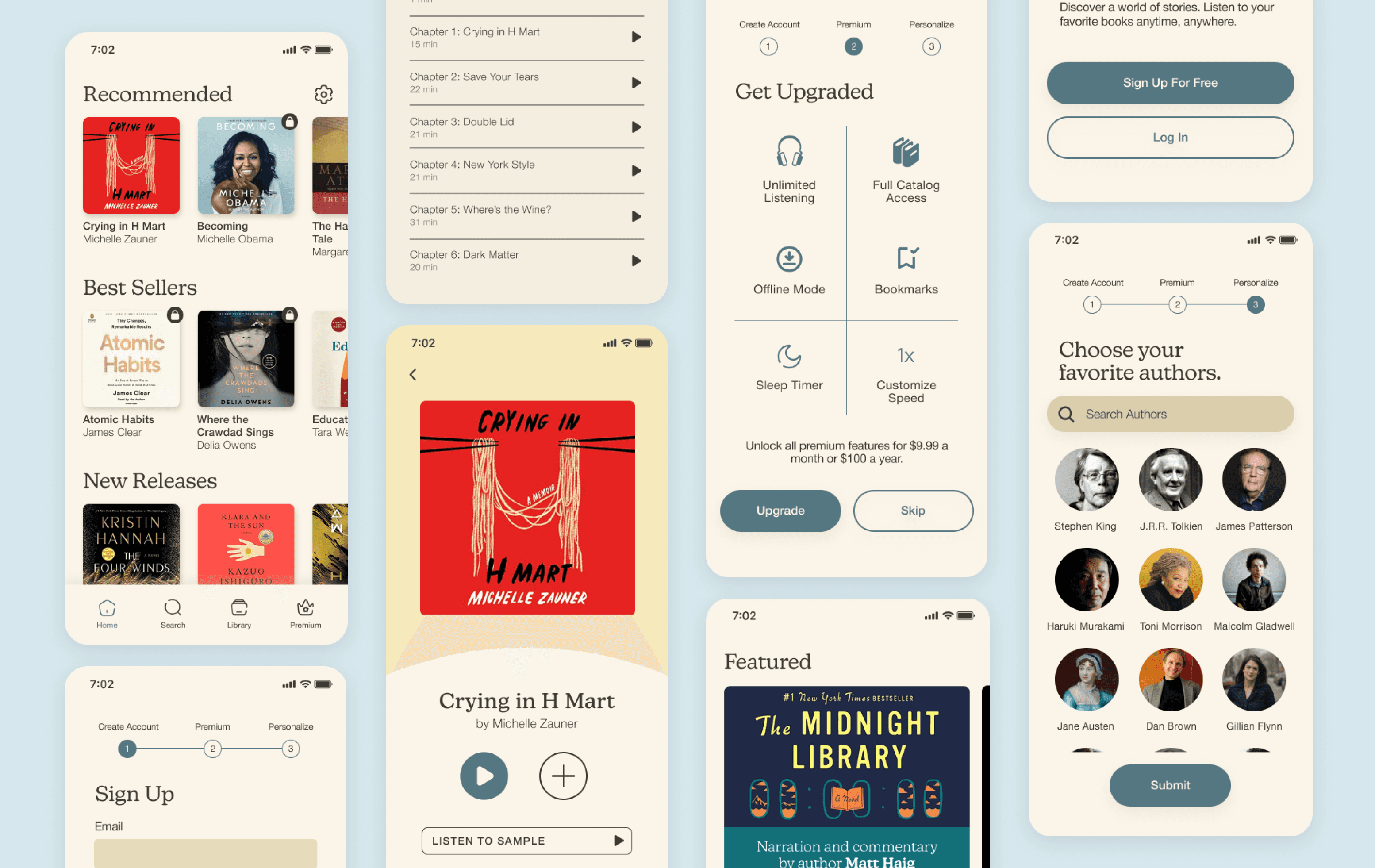
Initially labeling premium content with a star icon confused users–thinking it meant best selling or favorite content. Switching to a lock icon better communicated exclusivity in content.
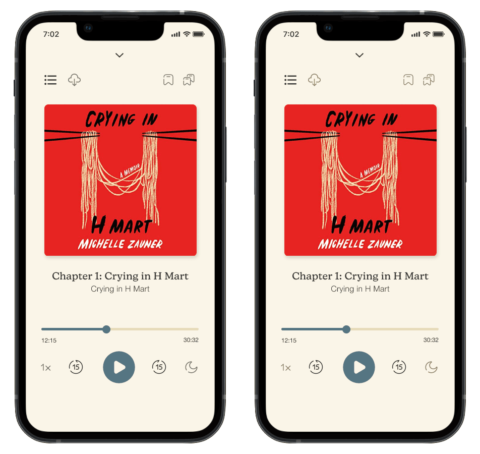
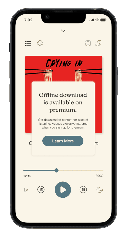
In the audio player screen, users were unable to differentiate between free and inactive, premium features. I created more color contrast to emphasize inactivity of premium perks in a free account.
Premium should feel like premium.
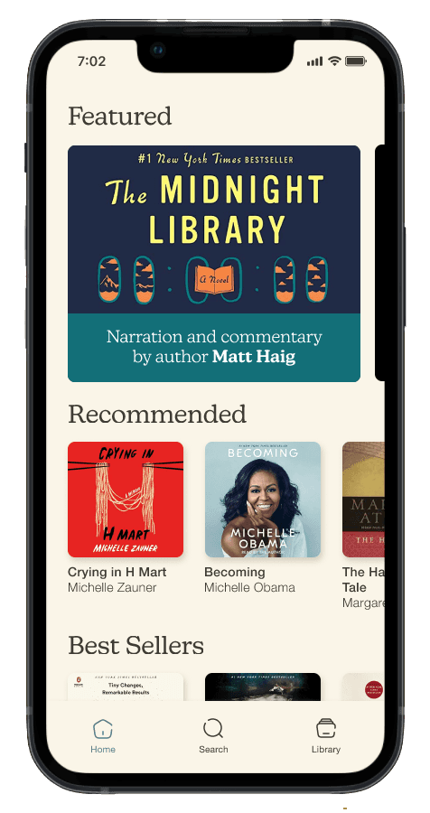
Users want a significantly different premium experience (from the free model) to feel like they're getting their money's worth. To emphasize this, I made a clear visual difference once they switch over, by adding a carousel with exclusive content.
If I had more time, I would love to explore and research other elements that could make this screen more dynamic. Since my main focus was the transition between a free model to a premium model, I didn’t have as much time to focus on the premium experience alone.
Explain premium better.
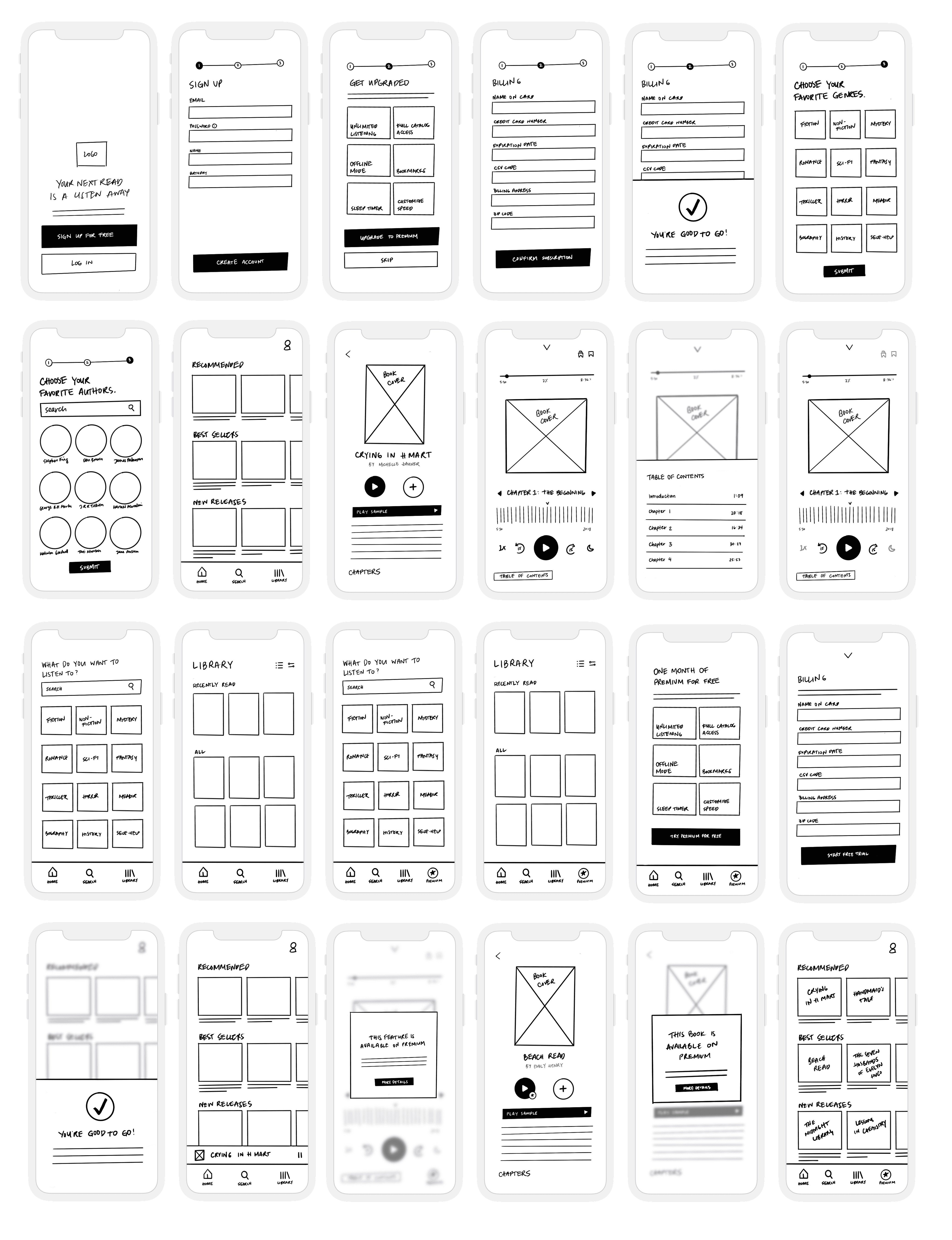
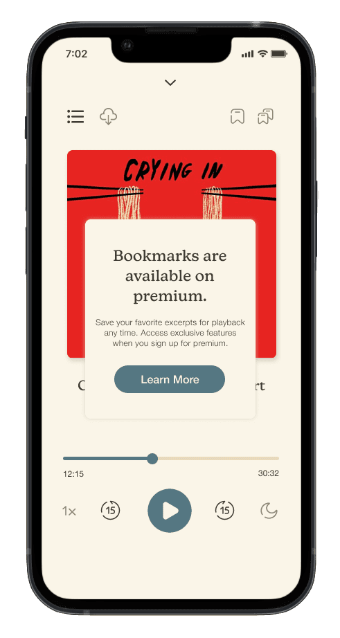
Free membership users see premium features as inactive (as grayed out elements). However, users did not have enough context around the inactive icons, so I added a popup to provide more information. These teach users about perks within their experience of listening, instead of reading it on a separate screen as a list.
Starting with premium
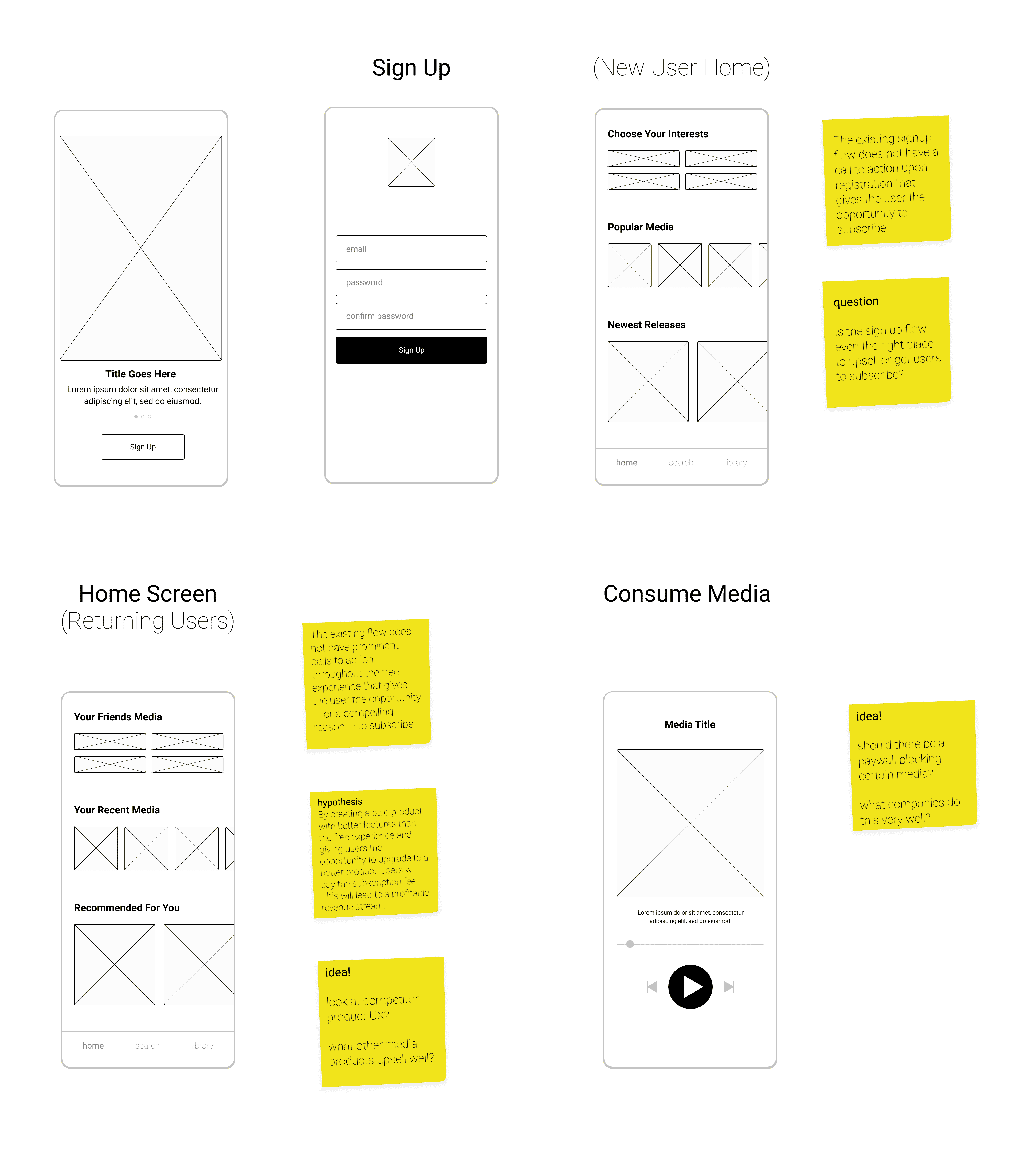
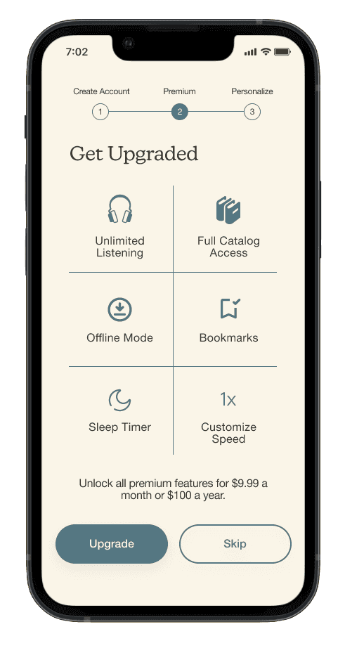
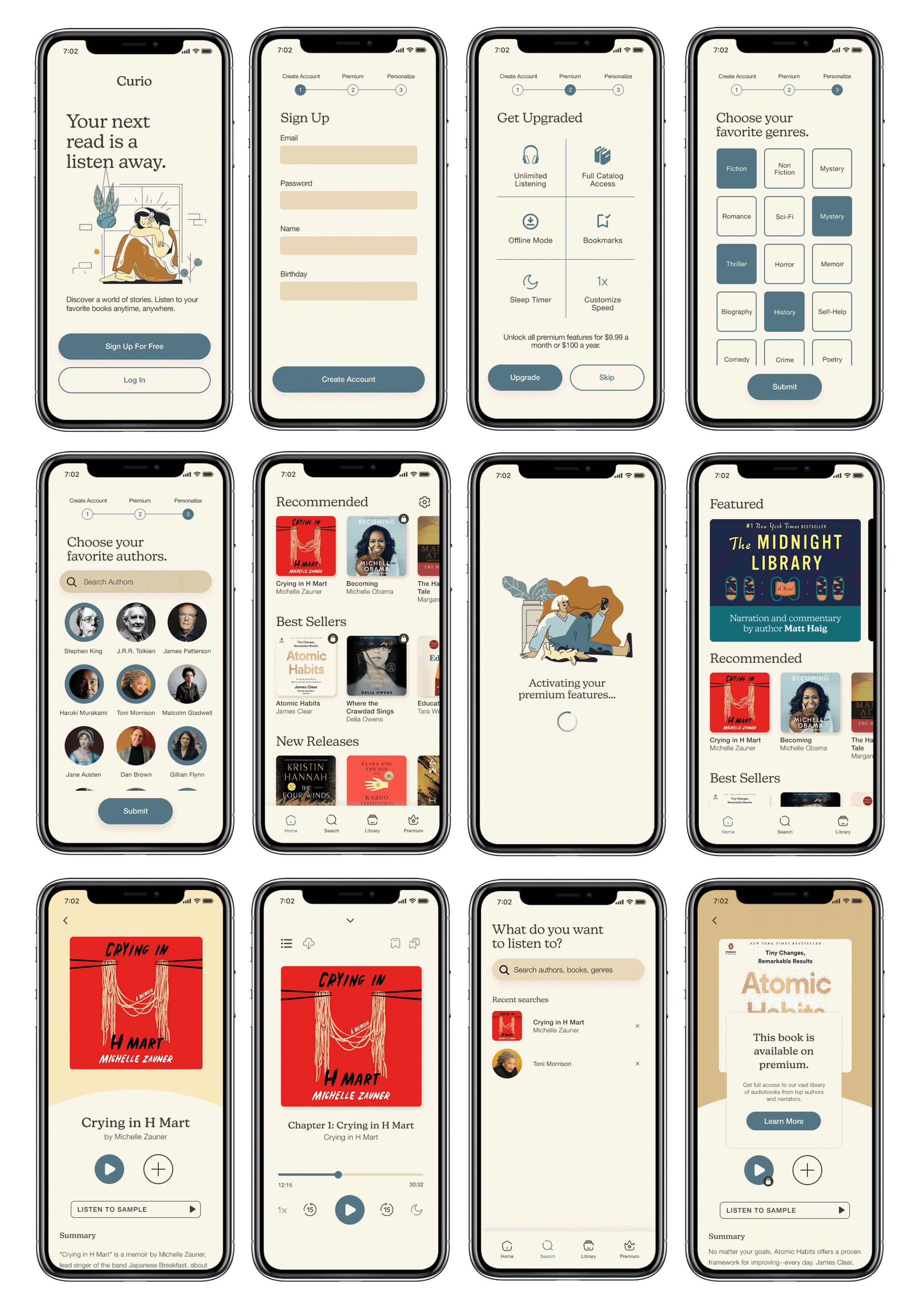
The app’s sign-up flow has a simple prompt for premium at the start. It highlights the main features in a skimmable, easy to read format. Users can choose to skip this decision later if they prefer to explore the free app first.
Premium sign-up is optional and easy to find.
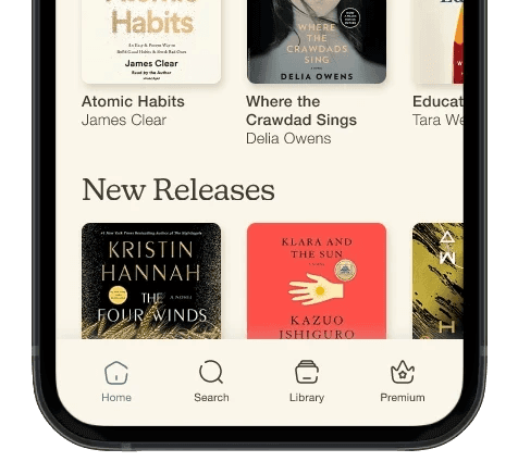
When users skip the prompt, they can easily find premium on the navigation bar. Users loved the placement because they can choose when to interact with it.
Several gentle opportunities for premium sign-up.
Prompts are not intrusive, but not hidden either. In addition to the premium tab, users learn about premium in the player timeline. This showcases features concisely and consistently without ads.
When building a solution you're unsure about, step away and come back.
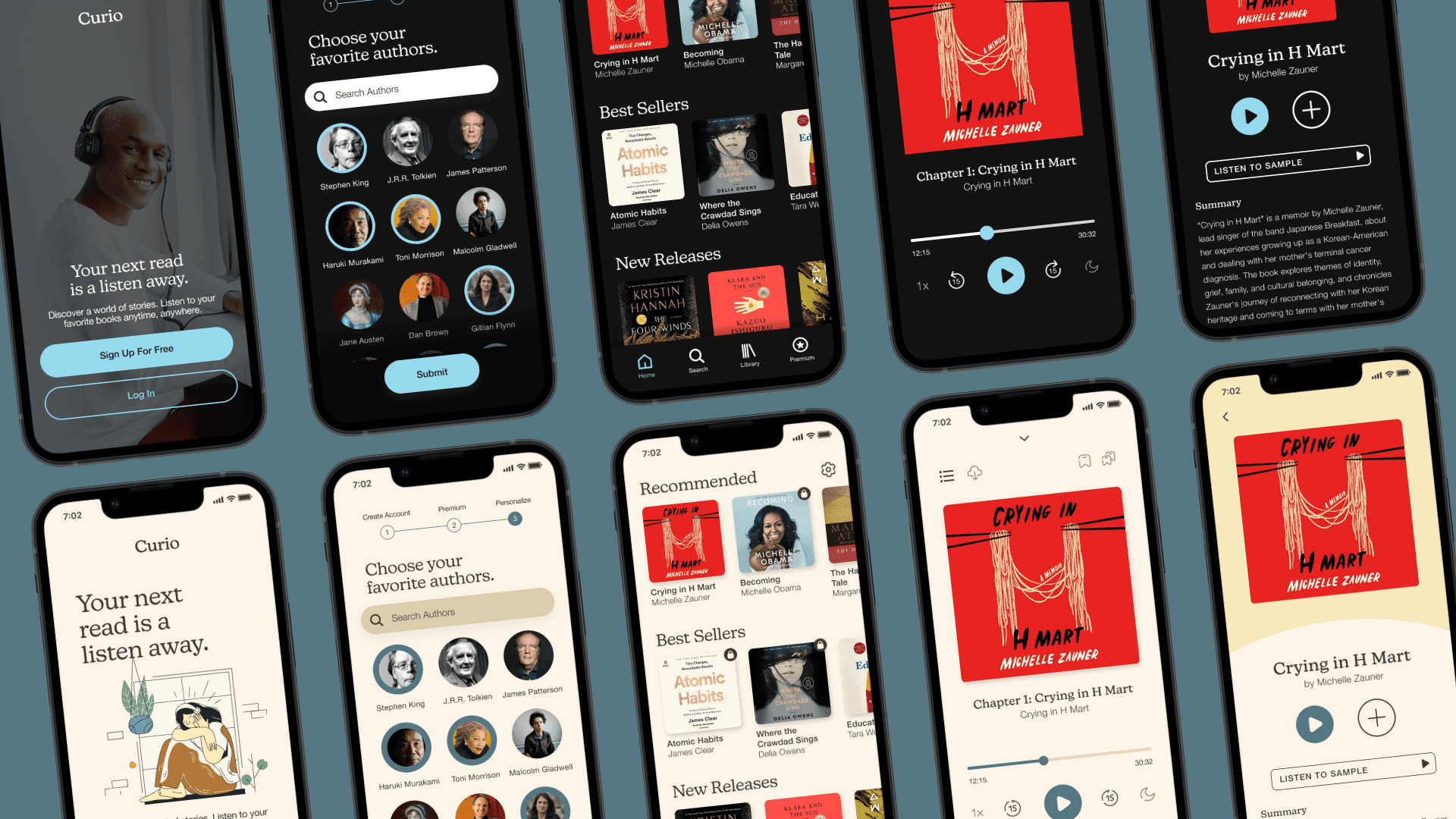
I initially had a different look for this interface. Inspired by current leaders in the industry, I opted for a dark user interface to allow book covers to pop out. However, the company’s brand keywords were bold, hip, and smart. I didn’t quite get the essence of these words from the dark execution, which felt too generic. The next day, I flipped it to a brighter UI and found it better fit the brand’s key words.
Limitations should be designed in a way that prevents a negative experience.
Making eating at home less of a chore
iOS App Design
Optimizing productivity & communication
Web Redesign

